By early 2013, we had one of the first Daily Fantasy Sports apps on the market, and by far the easiest to use.
Traditional fantasy sports "leagues" are played over the entirety of a sport's season. Swoopt, on the other hand, let users compete everyday by offering daily contests, the outcome of which will be known in as little as a few hours.
The Look & Feel
The biggest design challenge was maintaining a unified look and feel across a variety of features. The feature list is a long one, including creating and editing lineups, contest selection, chat and athlete/user profiles, to name a few.
All are extremely important to the platform and each have very different requirements for task completion. It was my job to create a unifying experience throughout the app and to distill the UI down to what is essential to the task.
Creating a Lineup
The most important task-flow (aside from onboarding) is the team creation process. We felt the need to strip out most of the UI from the toolbar to keep the interface as simple and intuitive as possible. The user has to know exactly what to do and what to expect.
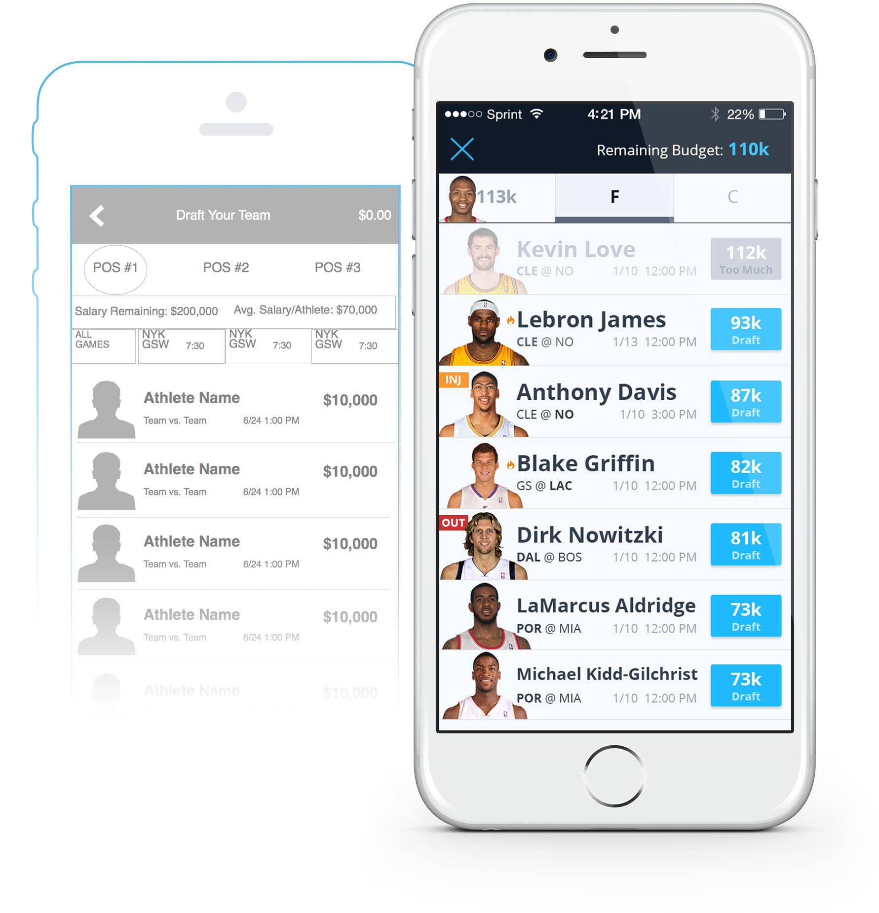
Advanced options, like the game filter and athlete search, were placed in a vertical drawer hidden behind the navigation bar. It is triggered by scrolling up just a few pixels.
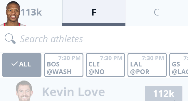
Games Drawer (Detail).
Open Contests
In an attempt to avoid cognitive overload, a lot of care was taken to whittle down contest information and display it much like a ticket to a sporting event: a head-to-head style graphic to create excitement, balanced against the contest details.

Contest Identifier (Detail). It was quite a challenge to fit all the necessary information into such a small area: Sport / contest type / winnings, to name a few.
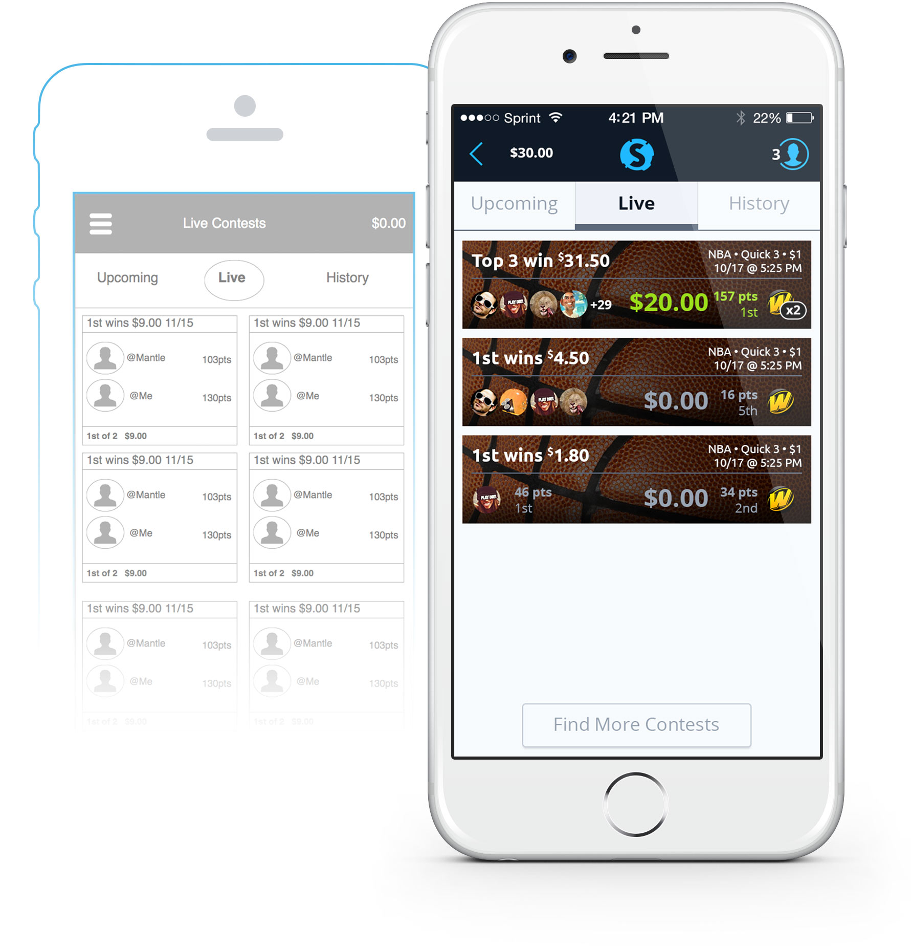
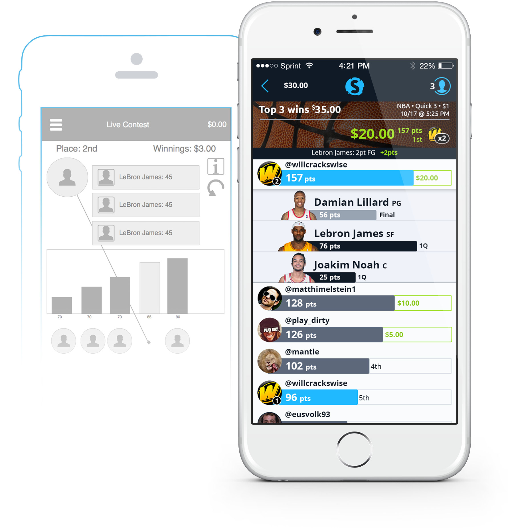
Live Progress Tracking
We tried filling the "entertainment gap" left over from competitor apps by providing a leaderboard-style progress chart, with scores and winnings, animations for scoring updates and even lineup comparisons to see which athletes are performing and which aren't.
In The End…
My biggest takaway from this experience was the organization and collaboration around design. As the lead (and only) in-house designer it was important for me to organize and communicate my thoughts succinctly, because the founders had ideas of their own, and if I didn't have data or feedback to support my assumptions, they were likely to fall on deaf ears.