Will Wright | product designer

Identifying Threats

Interface design @ CounterTack

Interface. Layout and visual design to help the user find what they're looking for.

Wireframes. The planning and thought process behind the interface.

Visualizations. Components that allow quick distillation of information.

Iconography. Custom designs to represent new and proprietary classes of objects.

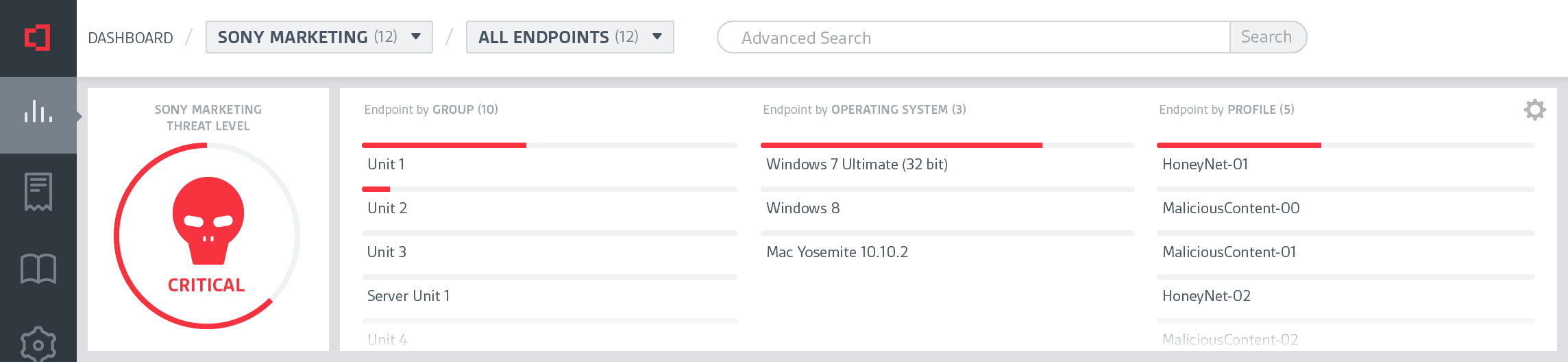
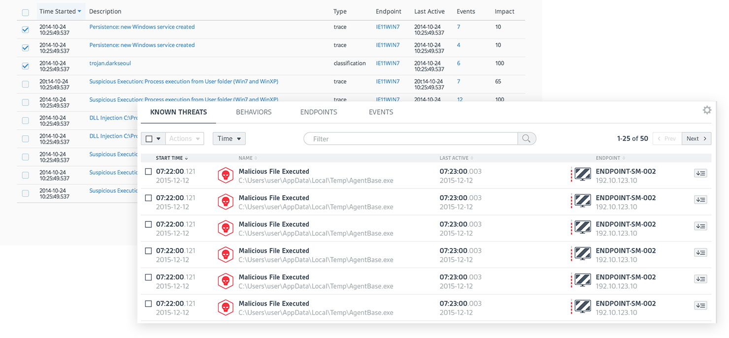
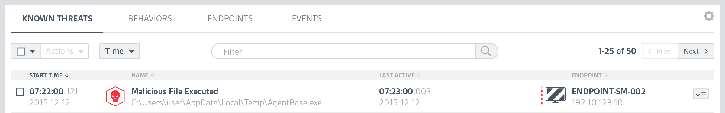
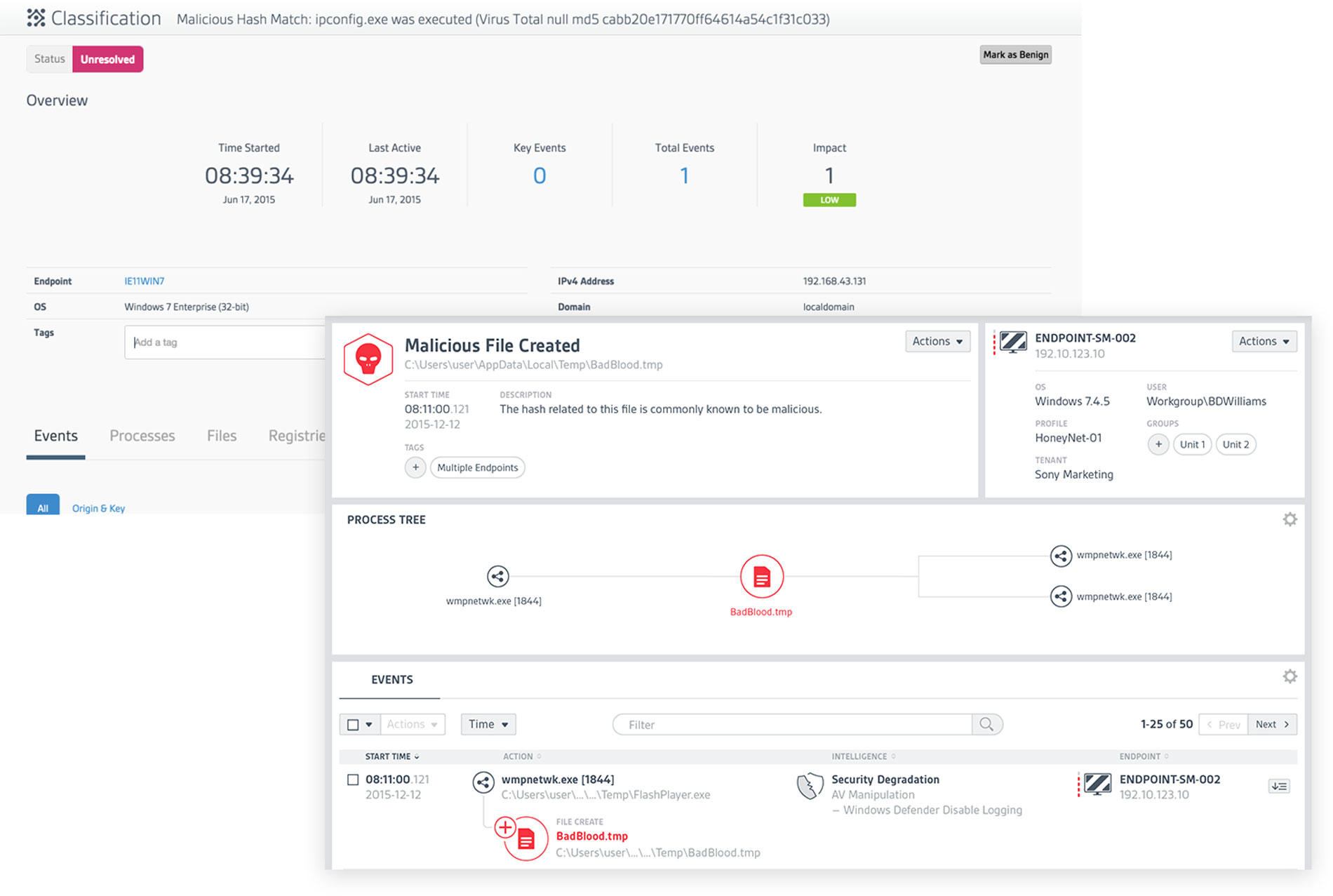
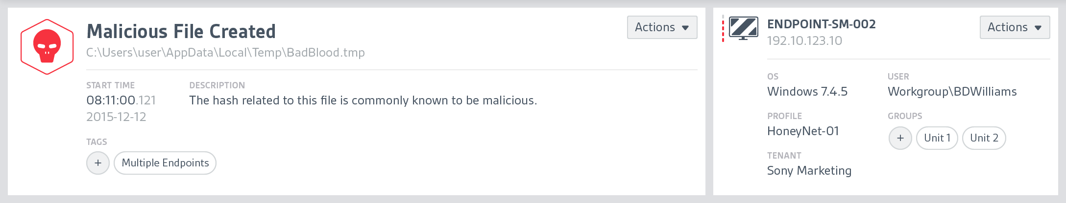
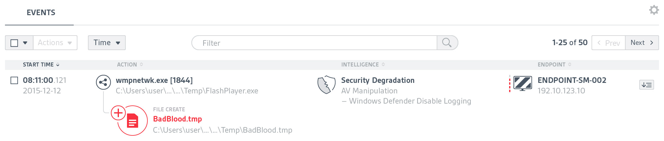
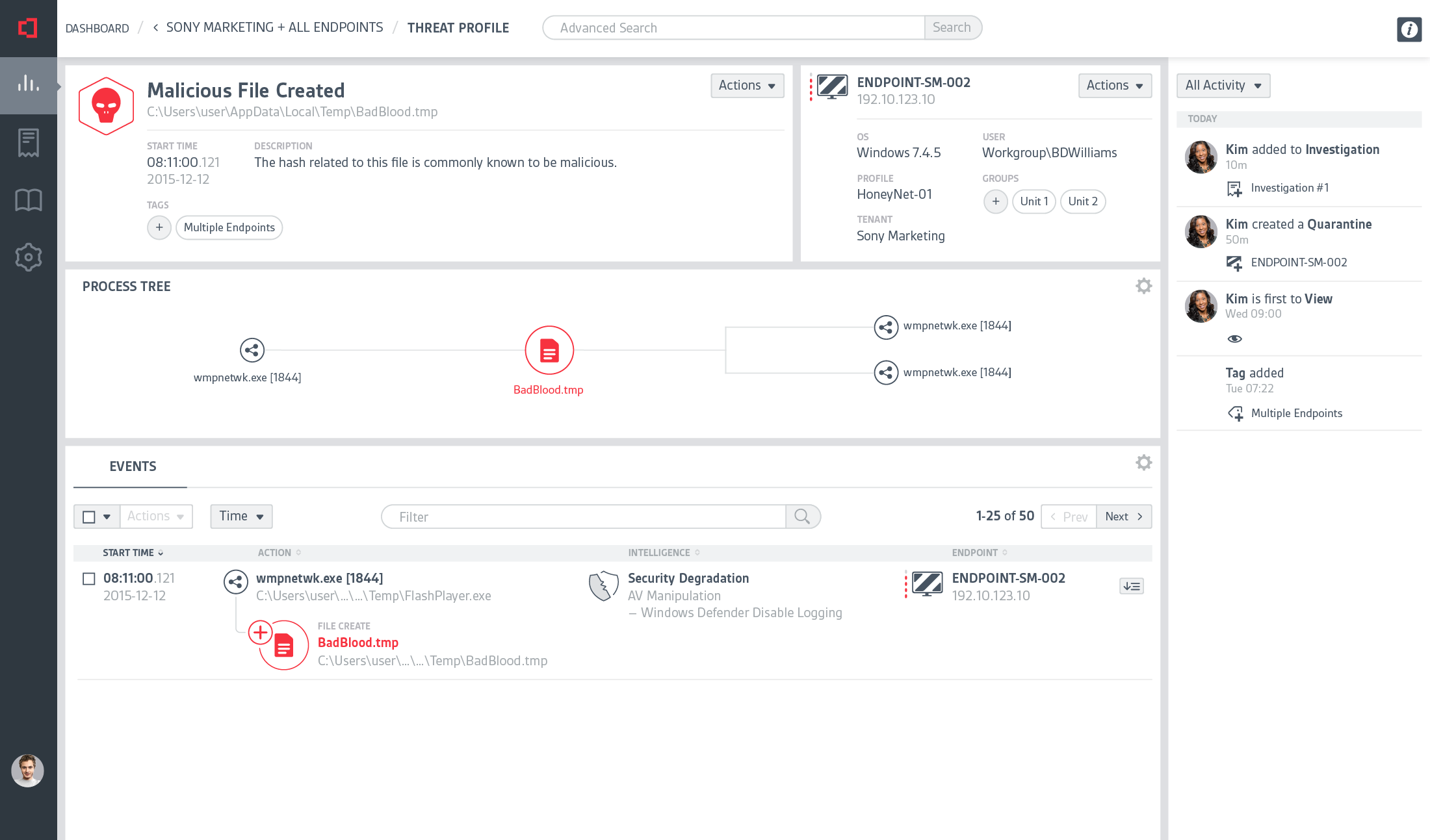
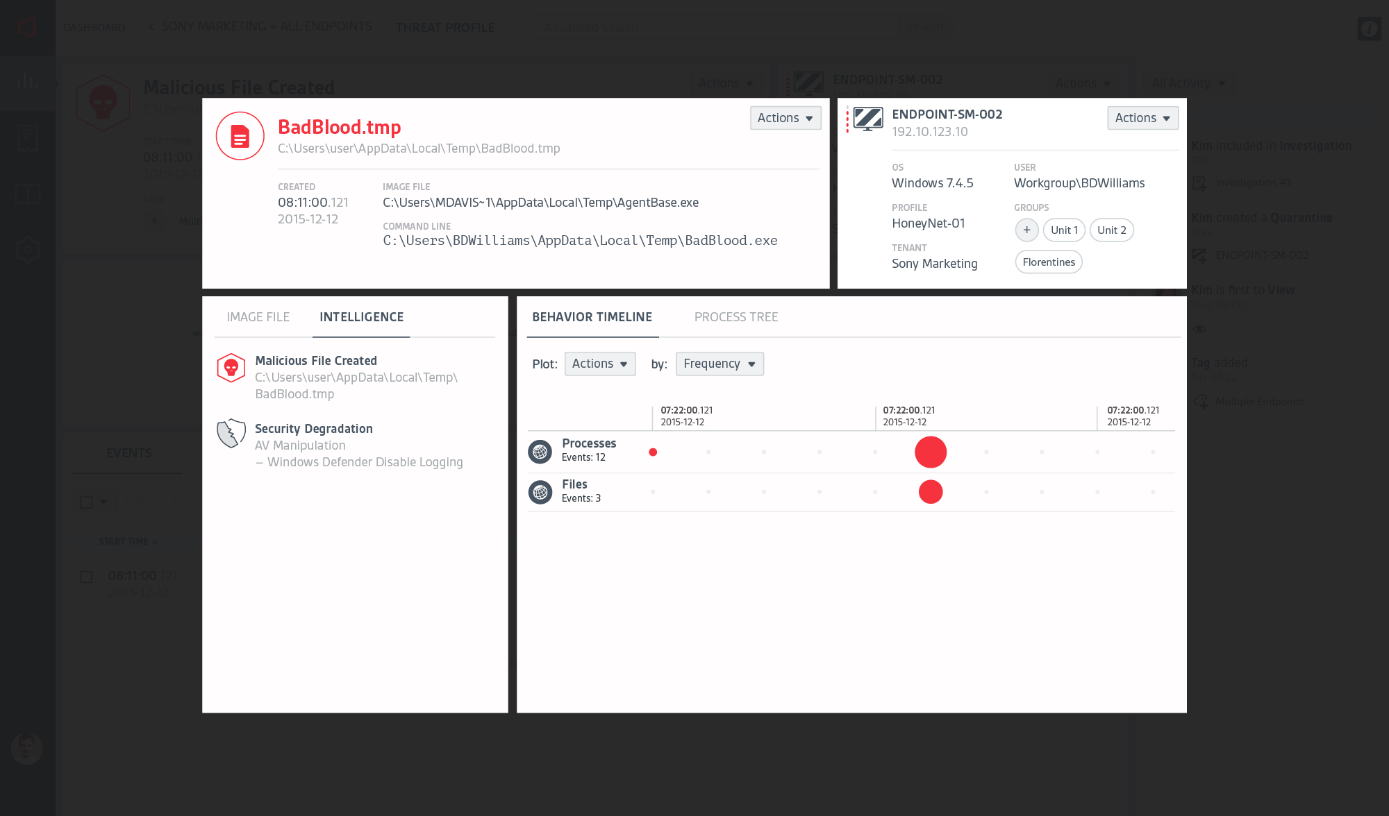
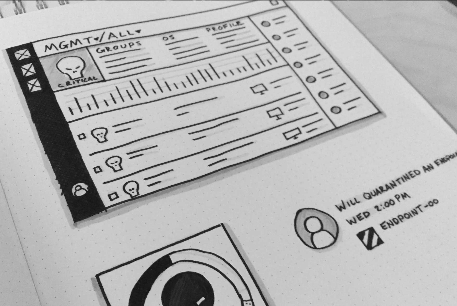
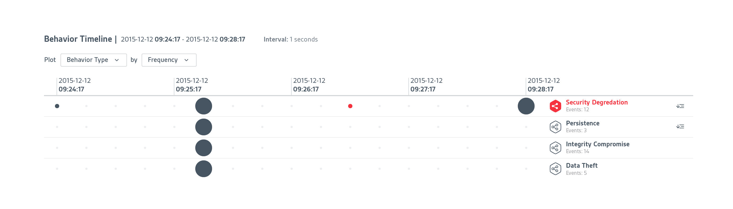
At CounterTack, our product was very useful for finding specific data that a user already knew something about, but it was a struggle for them to browse the data. There was just too much navigational friction, loose information architecture, and lack of visual clues to give users a clear path.

It was my responsibility to not only help clarify the user's journey through the product, but to clean up the interface so users can quickly find what they need.

Alerts

Our intelligence database is capable of detecting anomalies in large data sets, which gave us the ability to alert the user to suspicious or malicious content, but we weren't giving the user any context around the alerts, or the tools for sifting through the data without losing context

Users need consistency in the UI and visual cues to help guide them, otherwise they can easily get lost in the noise.

Dashboards

The original display of dashboard information led to more confusion than it did investigation. Users, when presented with large numbers for categories such as "Basic Events", didn't know if 43,000 basic events was a lot or a little, good or bad. Likewise, our labeling system is unique to us, so terms such as "Basic Events" can be misunderstood from the start. What's an event? What makes it basic? These were a few of the questions users were asking us.

Before/After: Dashboard. The original dashboard was saying a lot, but communicating little in terms of what analysts needed to know.

To acheive clarity, we made a large internal effort to reconsider our labeling system, removing labels that tended to not have relevance to the core experience and reorganizing information on the dashboards to communicate more effectively the information that was relevant.

Threat Levels (Detail). Red bars indicate severely compromised endpoints (computers, servers, devices, etc.). NOTE: Sony is NOT a customer of CounterTack, Inc. at time of writing.

Communicating volume was vitally important, as it indicates what is compromised and by how much. Collectively, the volume of compromised endpoints will always lead to a threat indicator, severity of which depends on a number of factors, including types of threats, number of endpoints affected and number of threats per endpoint.

Behaviors in Time

Indicating threats in time via goes even further in helping users understand where to look. The visual metaphor is similar to that of threat-by-volume, but instead of showing the number of threats relative to the overall number, we indicate that a new threat or behavior was detected within the time segment.

Timeline (Detail). Here, the red indicates a time segment that contains a potential threat.

The visual metaphor is similar, but instead of showing the number of threats relative to the overall number, we indicate that a new threat or behavior was detected within the time segment.

Behaviors as Lists

Another key indicator for threat activity are lists. Lists provide essential high-level information about what has happened on the network and, in terms of workflow, will typically be the starting point for a security investigation.

Threat List: Before & After. Lists had little clear hierarchy of information or visuals to anchor the user's attention. I wanted to make the important elements pop while maintaining the integrity of detail.

Initially, the list design was wordy, but I cleaned them up by removing what wasn't necessary for scanning and added visual anchors like the threat icon (for known threats) and endpoint icon to indicate where the threat originated.

Known Threat List (Detail). In easily sortable and filterable lists, we indicate what kind of threat it is.

As for the threats themselves, all research showed that users will invariably start with the lowest hanging fruit: the behaviors that are known to be malicious.

"Known Threats", as we call them, are typically files or processes known to carry harmful content, or internet domains notorious for transmitting malware. Giving them a red skull icon, no matter the type of known threat, proved the most effective approach for calling out their severity.

Behaviors (or signatures, as they are sometimes called) are alerts that represent a pattern of behavior that may or may not be an indication of malicoius activity. Some well known examples include Trojan Horses, Worms, and Viruses.

Together, "Known Threats" and "Behaviors" provide very clear reference points for analysts to begin their investigations.

Object Profiles

Profiles are the next level of depth for investigations. Opening a Known Threat or Behavior profile offers a sharper look at why there was an alert in the first place. Opening an Endpoint Profile gives a bit of a higher level look at activity on endpoints.

The task for me was to clean up the data and present it in a way that helped the flow of information, rather than hinder it or make the user feel confused about where they've navigated to.

Behavior Profile: Before & After. Much like the Dashboard, the original layout was saying alot without communicating.

Threat List: Before & After. Lists had little clear hierarchy of information or visuals to anchor the user's attention. I wanted to make the important elements pop while maintaining the integrity of detail.

Opening a threat from a list will reveal the threat profile. Threat Profiles offer a high level glimpse at what objects were involved in the threat alert (the files, processes, internet connections, etc. that constitute the majority of activity on an endpoint, device, or server).

Events

These provide very clear reference points for analysts to conduct their investigations.

Events. Events represent the most basic type of behavior, without which no threat indicators could exist. They are comprised of two objects and an action between the two objects, such as: *process* *creates* *file*

Results

A more difficult design challenge, and one that had to be resolved, was to figure out ways to let users dig ever deeper into the data without losing their place.

Giving users a "landing page" when they navigate is tremendously important if you want them to understand where they are in their flow. We learned that our users, on average, remember about 5 levels.

Sentinel Cluster Icon